Cooper Union Typography

All about Typography, well, mostly about Typography.

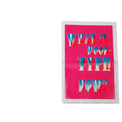
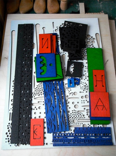
Woodtype Now!

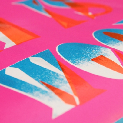
shimming — three colour print

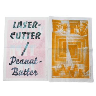
left side: laser halftone — two colour print
right side: adhesive foil profile one colour print

plywood — one colour print

left side: hairline — one colour print
right side: pressure type on halftone block — one colour print

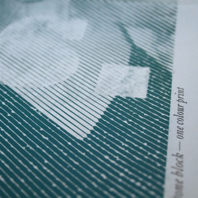
Detail: pressure type on halftone block — one colour print

Woodtype Now!

The offset printing industry was revolutionized through the introduction of digital design methods in combination with mechanical production. this development has not yet affected traditional letterpress and relief printing methods, which have since been marginalized.

Wood type now! seeks to transform these traditional mechanical production methods into the 21st century by revolutionizing the way that prints are designed and produced by incorporating new peripheral hardware (i.e. lasercutter). through the process of exploring the possibilities in regards to materials used and the way the classic printing block and set up are interpreted, the project redefines the conventional boundaries of the subject matter – as opposed to recreating a status quo with new means – and unlocks new frontiers.

This research catalog in form of a web-site, documents the design-principles and –techniques wich have been aquired through extensive practical tests. the potential is further expressed by the design and production of a poster series. the catalog, as well as the exemplary translation, are meant to show a broad range of possibilities in a contemporary context without trying to be conclusive, rather inviting further experimentation and interpretation.

I know this is the second post in a row that features woodblock typography/printing but, I couldn’t resist. It’s nice to see different ways to approach letterpress printing.

Filed under: Typography

Peter Nencini — Make Do Image Making & Hand Werk


 Great Q&A with Peter Nencini on the Walker Art Center design blog. Really worth reading. 

Also:

www.peternencini.co.uk

peternencini.blogspot.com

Filed under: Designers

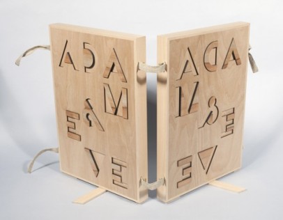
Adam & Eve

I received an email a few days ago with this great image. It is from a project by the graphic designers Richard Niessen & Esther de Vries. I really like their use of Bifur and hope to see it used more often by other designers.

This is what they write about it: “Niessen & de Vries designed a special box for the drawing and the etching of Adam and Eve by Rembrandt van Rijn (1638). It was made in collaboration with Raf Snippe for the Prentenkabinet of the University of Leiden. The box brings together the forestudy and the etching in which Rembrandt depicts Adam and Eve in an unorthodox way. The designers focussed on the mirroring image of the etching technique and the ambiguous scene using the two-part typeface Bifur (1929) by A.M. Cassandre in contrary relief, with parts in apple wood. The box with the art works is now shown in a small exhibition in University of Leiden.”

Filed under: Designers, Links, Typefaces, Typography

“Shungu: The Resilience of a People”, a film screening

A slight departure from the typical typography-related posts, but not entirely unrelated. This is an announcement for a film screening by one of the most interesting figures in the world of typography and academia, Saki Mafundikwa. Saki founded and runs Zimbabwe’s first design and new media college, the Zimbabwe Institute of Vigital Arts (ZIVA). He has previously taught at Cooper Union, holds and MFA from Yale and has written extensively on African writing systems. In 2004 the book he wrote, “Afrikan Alphabets: The story of writing in Afrika”, was published by Mark Batty Publisher.

On Wednesday, April 14th he he will be screening his film Shungu at the Cooper Union. The film is “a compelling narrative of the strategies ordinary people use to survive in Zimbabwe today… The filmmaker takes us on a personal journey offering a rare, intimate insight as the country experiences political turmoil, economic meltdown and health care collapse.”

Screening details:
Wednesday, April 14, 2010
4 to 6 pm

Screening followed by Q&A
Frederick P. Rose Auditorium
41 Cooper Square, New York, NY

Free and open to the public

Please attend if you are in the area and help spread the word about this unique opportunity to see this film.
Read the rest of this entry »

Filed under: Events, Lectures, People

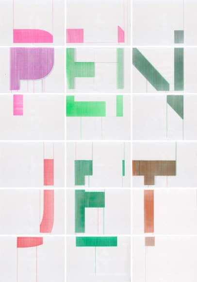
PenJet

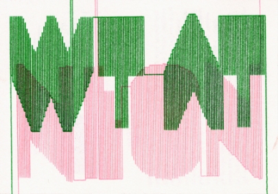
The PenJet project is a collaboration of Rietveld Academie students Jaan Evart, Julian Hagen and Daniël Maarleveld. The project has originated from the workshop “Uncommon Usage” given by Jürg and Urs Lehni. During the workshop we experimented with the movement of print heads.

In general the new possibilities of every new technique influence the design process. This is the case for new alternatives of a printer. Therefore we decided to continue the project after workshop. Every brand of the printers has its own manner of movement and characteristic rhythm. The Penjet shows the handwriting of the machine, some fine and straight, others more messy. The quality settings of the printer (presentation/normal/300X300 dpi/150X150dpi etc.) influence the way the lines are drawn. The final result has both – the imperfections of handwriting as the preciseness of a machine. Every page is unique.

PenJet

Filed under: Illustration, Lettering, Typefaces, Typography

Type & Music Videos

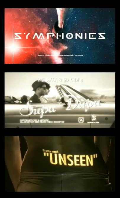
dan black & kid cudi symphonies
Another music video that mines the film-title typography as inspiration. All good except for the use of dumb quotes in the Goldfinger section (the original titles were by Robert Brownjohn.) This is also in the same vein as the video for Justice’s DVNO.

Full video after the cut: Read the rest of this entry »

Filed under: Typography

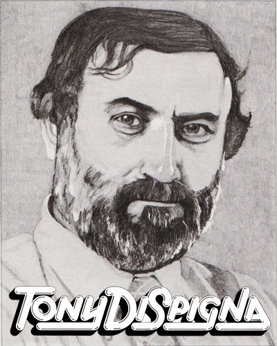
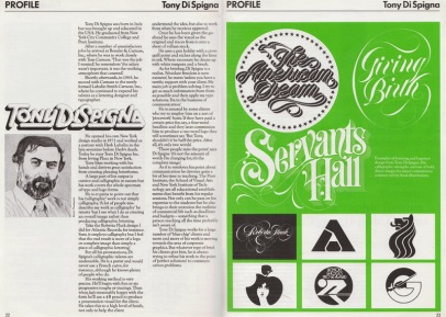
Baseline interview with Tony Di Spigna

Tony Di Spigna was born in Italy but was brought up and educated in the USA. He graduated from New York City Community College and Pratt Institute. After a number of unsatisfactory jobs he arrived at Bonder & Carnase, Inc., where he was to work closely with Tom Carnase. ‘That was the job I wanted’, he remembers ‘the salary wasn’t important, it was the working atmosphere that counted.’ Shortly afterwards, in 1969, he moved with Carnase to the newly formed Lubalin Smith Carnase, Inc., where he continued to expand his talents as a lettering designer and typographer.

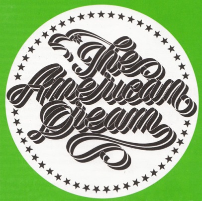
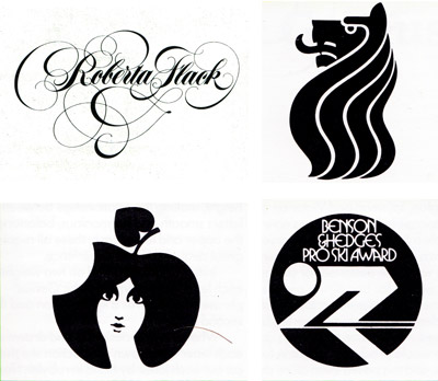
He opened his own New York design studio in 1973 and worked as a partner with Herb Lubalin in the late seventies before Herb’s death. Today he runs Tony Di Spigna Inc. from Irving Palace in New York. Tony likes working with his hands and derives great satisfaction from creating pleasing letterforms. A large part of his output is cursive and calligraphic in nature but his work covers the whole spectrum of type and logo forms. He is at pains to point out that his ‘calligraphic’ work is not simply calligraphy. ‘A lot of people misdescribe my work as calligraphy’ he retorts ‘but I see what I do as creating an overall image rather than producing calligraphic lettering. Take the Roberta Flack design I did for Atlantic Records, for instance. Sure, it employs calligraphy but I feel that the end result is more of a logo or complete image than simply a piece of calligraphic lettering.’

For all his protestations, Di Spigna’s calligraphic talents are undeniable. He is a purist and would never use a French curve, for instance, although he knows plenty of people who do. His working method is very precise. He’ll begin with five or six progressive roughs or tracings. Then when he’s reasonably happy with the form he’ll use a 4B pencil to produce a presentation visual for the client. He takes this to a high level of finish, not only to help the client understand the idea, but also to work from when he receives approval. Once he is given the go-ahead he uses the visual as the original and traces from it onto a sheet of vellum stock. He uses a pen holder with a crow quill point and etches along the lines in ink. Where necessary he cleans up with white tempera and a brush.

As for briefing, Di Spigna is a realist, ‘Absolute freedom is non-existent,’ he states ‘unless you have a terrific rapport with your client. My main job is problem solving. I try to get as much information from them as possible and then apply my type solutions. I’m in the business of communication.’ He is amused by some clients who try to employ him on a sort of ‘piecework’ basis. If they have paid a certain price for, say, a four-word headline and they later commission him to produce a two-word logo they will sometimes say ‘But Tony, shouldn’t it be half the price. After all, it’s only two words.’ ‘These people miss the point.’ says Di Spigna ‘it’s not the amount of words I’m charging for, it’s the complete image.’

As if to reinforce his point about communication he devotes quite a bit of his time to teaching. The Pratt Institute, the School of Visual Arts and New York Institute of Technology are all educational establishments that benefit from his regular sessions. Not only can he pass on his expertise to the student but he also brings to their attention the realities of commercial life such as deadlines and budgets – something that a person teaching all the time probably isn’t aware of.

Tony Di Spigna works for a large number of ‘blue-chip’ clients and more and more of his work is moving towards the area of corporate graphics. But whatever type of brief his clients give him, he is always trying to refine his work to the point of ‘perfect solutions’ to communication problems. 

This article was transcribed from an old Baseline Magazine. The date that it was published is unknown.

Thanks to Jeremy Pettis who posted the scanned article on his Flickr and So Much Pileup for the post. 


Filed under: Calligraphy, Designers, Lettering, Lubalin, Typography

Rare Books on Calligraphy and Penmanship


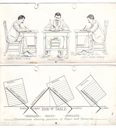
Mike Essl has just sent me a link to a great visual resource of old calligraphy and penmanship manuals, where the above images are from. What’s even more impressive is that most of them are available in PDF form. Take a look at what they have: www.iampeth.com/books.php

More images after the cut… Read the rest of this entry »

Filed under: Books, Calligraphy, Lettering, Links, Reference

Alexis Anne Mackenzie


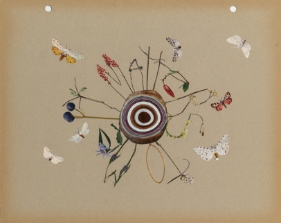
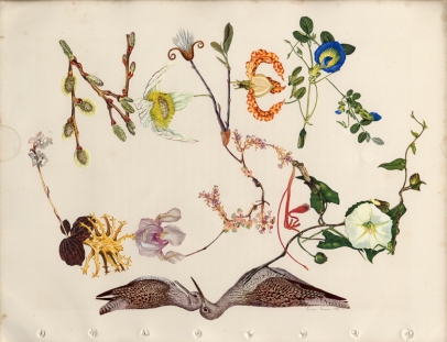
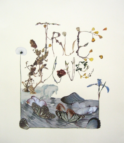
Alexis Anne Mackenzie uses collage to create some stunning typographic pieces.

Filed under: Typography

If You Could Collaborate – Job Wouters & Roel Wouters

Dutch typographer Job Wouters is better known as ‘Letman’, but regardless of what you decide to call him, his work is always of the highest order. Expressive and dramatic, he treats letters with the care and respect they deserve and this appreciation has led him to create compelling, hand-drawn work for clients all over the world.

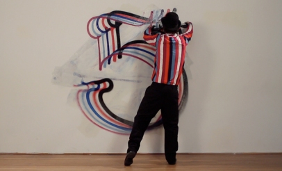
His brother is an equally as exciting practitioner and the siblings have combined to create a new spray-painting machine called the Rainbow gun, which will be utlised in the gallery itself.

Watch the Rainbow Gun video here

Check out the rest of the collaborations. There are some really great projects combining art and design.

Filed under: Links, Typography

Lettera


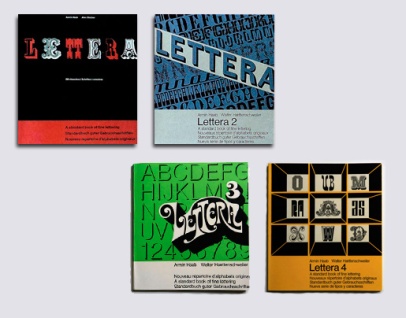
I came across a really interesting series of books on typefaces/lettering in two different places online recently and decided to investigate further. The four-volume series was called Lettera, A standard book of fine lettering, written or, perhaps more precisely, curated by Armin Haab (with Alex Stocker for volume 1 and with Walter Haettenschweiler for volumes 2, 3 and 4), and published in Switzerland by Arthur Niggli. (Arthur Niggli published and continues to publish great books on typography by Karl Gerstner, Gerard Unger, Adrian Frutiger, Armin Hofmann, Josef Müller-Brockmann and Jost Hochuli among others). The first volume is in its 9th edition, the first being in 1954. The books are a curious collection of examples of a wide range of typographic styles, with a heavy leaning towards lettering. Still, the mix of examples is hard to justify in the groupings that they are in. But, perhaps not having seen a copy in real life one shouldn’t judge; and the individual examples are rather fascinating regardless of order or context.
Read the rest of this entry »

Filed under: Books, Reference, Typefaces, Typography

Aldo Novarese

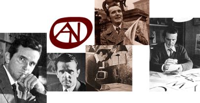
Aldo Novarese is someone I meant to post about some time ago, as his incredibly prolific type-design career spanned over 50 years (into the 1990’s) and produced over 70 typefaces (over 200 if we count the various weights & styles). His typefaces helped shape the visual landscape of the 1950s and beyond, with such classic faces as Eurostile, Stop, and ITC Novarese. The Microgramma/Eurostile typeface has become synonymous with Mid-Century Modernism. Much like his contemporary Roger Excoffon (in charge of the Fonderie Olive type foundry) Novarese led the prominent Italian foundry Nebiolo and left a similar mark on the world of typography.
Read the rest of this entry »

Filed under: Designers, People, Reference, Typefaces, Typography

del.icious.us Feed

Typography Photos

Sort posts by category

Archives