Cooper Union Typography

All about Typography, well, mostly about Typography.

Rare Books on Calligraphy and Penmanship


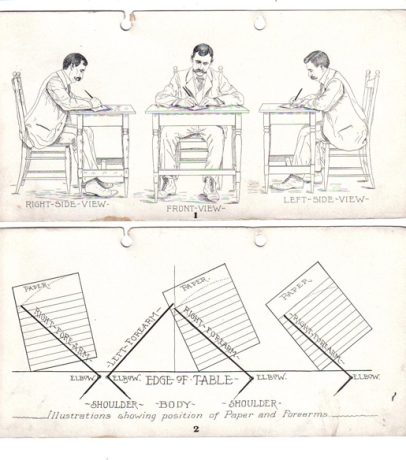
Mike Essl has just sent me a link to a great visual resource of old calligraphy and penmanship manuals, where the above images are from. What’s even more impressive is that most of them are available in PDF form. Take a look at what they have: www.iampeth.com/books.php

More images after the cut… Read the rest of this entry »

Filed under: Books, Calligraphy, Lettering, Links, Reference

Lettera


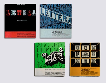
I came across a really interesting series of books on typefaces/lettering in two different places online recently and decided to investigate further. The four-volume series was called Lettera, A standard book of fine lettering, written or, perhaps more precisely, curated by Armin Haab (with Alex Stocker for volume 1 and with Walter Haettenschweiler for volumes 2, 3 and 4), and published in Switzerland by Arthur Niggli. (Arthur Niggli published and continues to publish great books on typography by Karl Gerstner, Gerard Unger, Adrian Frutiger, Armin Hofmann, Josef Müller-Brockmann and Jost Hochuli among others). The first volume is in its 9th edition, the first being in 1954. The books are a curious collection of examples of a wide range of typographic styles, with a heavy leaning towards lettering. Still, the mix of examples is hard to justify in the groupings that they are in. But, perhaps not having seen a copy in real life one shouldn’t judge; and the individual examples are rather fascinating regardless of order or context.
Read the rest of this entry »

Filed under: Books, Reference, Typefaces, Typography

Design and Typography Books

A small list of important and useful Typography and Design books.
Read the rest of this entry »

Filed under: Books, Typography

“Detail in typography” by Jost Hochuli

Detail in typography

I highly recommend this book. It is a compact but highly useful reference on typography.

Publisher’s description of the book:
“Jost Hochuli’s concise guide to micro-typography considers everything that can happen within a column of text. Detail in typography discusses in simple steps the factors that make text easy to read and good to look at. Hochuli starts by describing what we know about the reading process. Then he looks at the letters of the Latin alphabet: what is good form in letters? How has script and type developed? How do letters work as visual elements? He goes on to discuss words: how do they hang together? How do we recognize them? Next, he looks at lines of words, and thus at the space between words. Also here he considers punctutation as an element of the line. Then there is the question of the space between lines (‘leading’): what are the factors there? The book is rounded off with a look at typefaces and their properties.

Detail in typography, designed by its author, is printed and bound in Switzerland to the best standards. It provides, in its own form and manufacture, a demonstration of how books can be made.”

Read more about it here.
Buy it here.

Filed under: Books, Typography
del.icious.us Feed

Typography Photos

Sort posts by category

Archives