Cooper Union Typography

All about Typography, well, mostly about Typography.

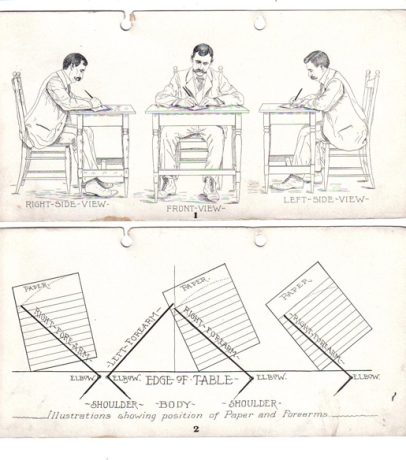
Rare Books on Calligraphy and Penmanship


Mike Essl has just sent me a link to a great visual resource of old calligraphy and penmanship manuals, where the above images are from. What’s even more impressive is that most of them are available in PDF form. Take a look at what they have: www.iampeth.com/books.php

More images after the cut… Read the rest of this entry »

Filed under: Books, Calligraphy, Lettering, Links, Reference

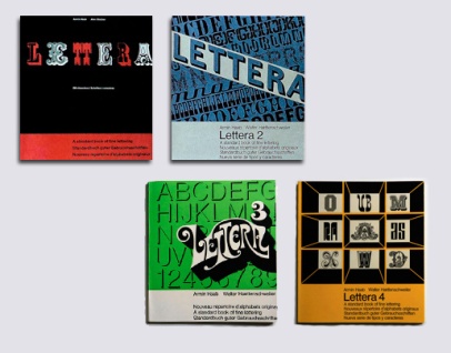
Lettera


I came across a really interesting series of books on typefaces/lettering in two different places online recently and decided to investigate further. The four-volume series was called Lettera, A standard book of fine lettering, written or, perhaps more precisely, curated by Armin Haab (with Alex Stocker for volume 1 and with Walter Haettenschweiler for volumes 2, 3 and 4), and published in Switzerland by Arthur Niggli. (Arthur Niggli published and continues to publish great books on typography by Karl Gerstner, Gerard Unger, Adrian Frutiger, Armin Hofmann, Josef Müller-Brockmann and Jost Hochuli among others). The first volume is in its 9th edition, the first being in 1954. The books are a curious collection of examples of a wide range of typographic styles, with a heavy leaning towards lettering. Still, the mix of examples is hard to justify in the groupings that they are in. But, perhaps not having seen a copy in real life one shouldn’t judge; and the individual examples are rather fascinating regardless of order or context.
Read the rest of this entry »

Filed under: Books, Reference, Typefaces, Typography

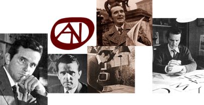
Aldo Novarese

Aldo Novarese is someone I meant to post about some time ago, as his incredibly prolific type-design career spanned over 50 years (into the 1990’s) and produced over 70 typefaces (over 200 if we count the various weights & styles). His typefaces helped shape the visual landscape of the 1950s and beyond, with such classic faces as Eurostile, Stop, and ITC Novarese. The Microgramma/Eurostile typeface has become synonymous with Mid-Century Modernism. Much like his contemporary Roger Excoffon (in charge of the Fonderie Olive type foundry) Novarese led the prominent Italian foundry Nebiolo and left a similar mark on the world of typography.
Read the rest of this entry »

Filed under: Designers, People, Reference, Typefaces, Typography

Lubalin Now

Lubalin Now

The inaugural exhibition in the newly re-located Herb Lubalin Study Center of Design and Typography.

Herb Lubalin (1918–1981) is best known for his wildly illustrative typography and his groundbreaking work for the magazines Avant Garde, Eros, and Fact.

On view in Cooper Union’s new gallery, the installation includes recent posters, publications, and motion graphics by internationally recognized graphic designers that spotlight an emerging trend toward expressive lettering and typography.

Original sketches, magazines, logotypes, and posters selected from the Lubalin Center Archive will illuminate Lubalin’s influence on contemporary graphic design.

On view: November 5, 2009 – December 8, 2009

Read the rest of this entry »

Filed under: Lubalin, People, Reference, Typography
Erik Nitsche

Erik Nitsche

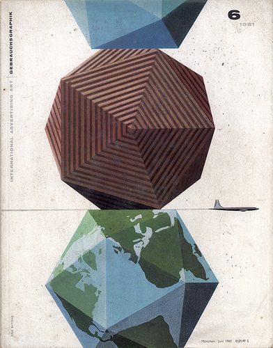
This post is less typographic, and more graphic.
I just think Erik Nitsche’s work deserves more exposure.
Read the rest of this entry »

Filed under: Illustration, Reference, Typography, ,

Design Process Videos [Updated]

process

I’ve recently seen a few video which document the process of designing publications. It is an intriguing idea, and hopefully something that deserves more attention. It would be nice to see other designers leave a trace of their process. In HD please.

[Update]: I also came across an interesting section on the SPD (Society of Publication Designers) website. The section (a blog really) is called The Process, and is dedicated, seemingly, to lifting the curtain off the publication design process. It’s a great idea and makes perfect sense that SPD is doing this, (most of the videos posted below also come from SPD). The first series of posts chronicle the design process of a feature article on Charlie Kaufman for Wired magazine, written by Wired creative director Scott Dadich.

Read the posts for yourself: The Process
Wired’s website is also cross-posting them: Storyboard

Some of the process videos I found are collected here:
Read the rest of this entry »

Filed under: Links, Reference, Typography

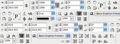
Converting Handwriting into a Font

Several ways of turning your handwriting into a font.
Read the rest of this entry »

Filed under: Links, Reference, Typefaces,

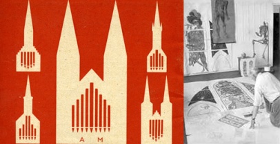
Alfred Mahlau

Alfred Mahlau

Read the rest of this entry »

Filed under: Reference, Typography, ,

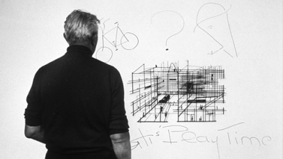
Assignment #5

assingment

Tati
Read the rest of this entry »

Filed under: Assignments, Reference, Typography, ,

Calligraphy

calligraphy

Some interesting examples of calligraphy I’ve come across recently.

Read the rest of this entry »

Filed under: Reference, Typography,

Civilité

civ_header

Civilité: a type designed by Robert Granjon as a French response to the Italian italic, and based on the cursive Gothic script as used in 1558. “Granjon called the type lettre françoise d’art de main, but because the type was very popular for school books and courtesy books, with ‘De Civilitate morum puerilium libellus’ (A Handbook on Good Manners for Children) by Erasmus serving as prototype, it now is generally known as Civilité type.” — quoted from viaLibri

Read the rest of this entry »

Filed under: Assignments, Links, Reference, Typography,

Industry Focus Newsletters from Font Shop

fontshop
Read the rest of this entry »

Filed under: Links, Reference, Typography

del.icious.us Feed

Typography Photos

Sort posts by category

Archives