Cooper Union Typography

All about Typography, well, mostly about Typography.

Adam & Eve

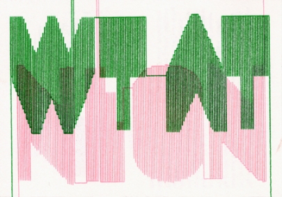
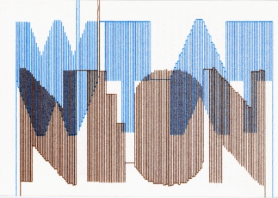
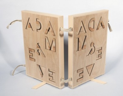
I received an email a few days ago with this great image. It is from a project by the graphic designers Richard Niessen & Esther de Vries. I really like their use of Bifur and hope to see it used more often by other designers.

This is what they write about it: “Niessen & de Vries designed a special box for the drawing and the etching of Adam and Eve by Rembrandt van Rijn (1638). It was made in collaboration with Raf Snippe for the Prentenkabinet of the University of Leiden. The box brings together the forestudy and the etching in which Rembrandt depicts Adam and Eve in an unorthodox way. The designers focussed on the mirroring image of the etching technique and the ambiguous scene using the two-part typeface Bifur (1929) by A.M. Cassandre in contrary relief, with parts in apple wood. The box with the art works is now shown in a small exhibition in University of Leiden.”

Filed under: Designers, Links, Typefaces, Typography
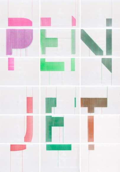
PenJet

The PenJet project is a collaboration of Rietveld Academie students Jaan Evart, Julian Hagen and Daniël Maarleveld. The project has originated from the workshop “Uncommon Usage” given by Jürg and Urs Lehni. During the workshop we experimented with the movement of print heads.

In general the new possibilities of every new technique influence the design process. This is the case for new alternatives of a printer. Therefore we decided to continue the project after workshop. Every brand of the printers has its own manner of movement and characteristic rhythm. The Penjet shows the handwriting of the machine, some fine and straight, others more messy. The quality settings of the printer (presentation/normal/300X300 dpi/150X150dpi etc.) influence the way the lines are drawn. The final result has both – the imperfections of handwriting as the preciseness of a machine. Every page is unique.

PenJet

Filed under: Illustration, Lettering, Typefaces, Typography

Lettera


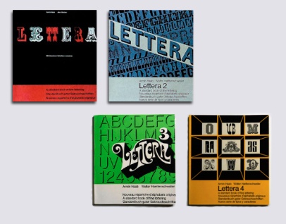
I came across a really interesting series of books on typefaces/lettering in two different places online recently and decided to investigate further. The four-volume series was called Lettera, A standard book of fine lettering, written or, perhaps more precisely, curated by Armin Haab (with Alex Stocker for volume 1 and with Walter Haettenschweiler for volumes 2, 3 and 4), and published in Switzerland by Arthur Niggli. (Arthur Niggli published and continues to publish great books on typography by Karl Gerstner, Gerard Unger, Adrian Frutiger, Armin Hofmann, Josef Müller-Brockmann and Jost Hochuli among others). The first volume is in its 9th edition, the first being in 1954. The books are a curious collection of examples of a wide range of typographic styles, with a heavy leaning towards lettering. Still, the mix of examples is hard to justify in the groupings that they are in. But, perhaps not having seen a copy in real life one shouldn’t judge; and the individual examples are rather fascinating regardless of order or context.
Read the rest of this entry »

Filed under: Books, Reference, Typefaces, Typography

Aldo Novarese

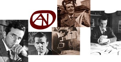
Aldo Novarese is someone I meant to post about some time ago, as his incredibly prolific type-design career spanned over 50 years (into the 1990’s) and produced over 70 typefaces (over 200 if we count the various weights & styles). His typefaces helped shape the visual landscape of the 1950s and beyond, with such classic faces as Eurostile, Stop, and ITC Novarese. The Microgramma/Eurostile typeface has become synonymous with Mid-Century Modernism. Much like his contemporary Roger Excoffon (in charge of the Fonderie Olive type foundry) Novarese led the prominent Italian foundry Nebiolo and left a similar mark on the world of typography.
Read the rest of this entry »

Filed under: Designers, People, Reference, Typefaces, Typography

Converting Handwriting into a Font

Several ways of turning your handwriting into a font.
Read the rest of this entry »

Filed under: Links, Reference, Typefaces,

zine – headline typeface

i kind of like Fakir…. it’s pretty out there but i think it’s interesting.
too bad it costs 100$ so no way of using it….Fakir black by Underware

http://www.underware.nl/site2/index.php?id1=fakir&id2=black

Filed under: Typefaces, Typography, , ,

New Typeface at Typotheque

klimax
Read the rest of this entry »

Filed under: Links, Typefaces, Typography

del.icious.us Feed

Typography Photos

Sort posts by category

Archives