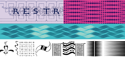
Since the days of the invention of movable type, type has always served as an elements in the overall construction of the page. The type slugs (or sorts) were set in lines, and those lines were framed together into a forme, which then went onto the press. So the idea of using type as form has always been an integral aspect of typography. Phototypesetting allowed the designers to treat type in new ways; it could now be overlapped, distorted. New photo-typefaces were designed to accommodate the new whims of the designers. Think of Avant-Garde with its extensive ligature set, especially in the hands of Herb Lubalin. Digital typography has pushed the boundaries even further. The studio of Richard Niessen & Esther de Vries take the notion of type as construction literally, and create beautiful, playful and refreshing designs. Richard refers to his approach as typographic masonry, and at one time called his studio exactly that.
Following along this train of thought I was curious what fonts were out there that played with this notion. Not simply symbol or dingbat fonts, but fonts that could be used to construct design; fonts which exploit the formal possibilities of type. So I collected together what I found.
Read the rest of this entry »
Filed under: Typography

